Click image to enlarge

Demographic Distribution

The first step in this analysis was to capture the distribution of the demographic information available: age, education, marital status, and income. This breakdown will help understand customer diversity and identify dominant segments.

  • Age Distribution: Most of the customer base is above the age of 35, with 1/3 between the ages of 35-44. This group likely prefers quality and reliability when purchasing any product. There's an opportunity to offer niche products, a la Trader Joe's, to generate more customers.
  • Education Distribution: Nearly 98% of the customers are educated at the college level or above. Having stores available close to major universities could not only help boost the number of customers in that age group but also increase familiarity for this group post-college.
  • Marital Status Distribution: Two-thirds are married. This could be a favorable group in terms of purchasing power. In the likelihood, married couples become parents, offering items in bulk would be beneficial.
  • Income Distribution: Since most customers earn under 100k, it would be beneficial to set reasonable prices, offer discounts and coupons, and bundle items. Additionally, rewards programs could help drive repeat customers.
  • Click image to enlarge

    Product Purchases by Demographics

    To understand spending patterns, we analyzed the products each of these groups purchased. Because this data does not contain the quantity purchased and only the dollar amount spent, it is difficult to identify appropriate analyses of favorable products.

  • By Age: Across all age brackets, nearly half of all customers spent most of their money on wine. The second leading product is meat.
  • By Education: We see similar breakdowns in the highly educated groups. High school graduates are more likely to spend money on gold products.
  • Click image to enlarge

    Product Purchases by Demographics

    Continuing:

  • By Marital Status: Across all marital statuses, the purchasing power is mostly towards wine.
  • By Income: Most income groups are, again, spending most of their money on wine. The exceptions: those earning under 25k are using their purchasing power for gold and meat; those earning over 150k are purchasing meat and wine.
  • Total Spend by Demographics

    Across all demographics, I visualized the distribution of total spending using violin plots that show the concentration of spending amounts and the variability within and across each group. The results are almost as expected: those with lower education or lower income are spending less, while the other groups see a nice distribution in spending. Surprisingly, the '18-24' and '65+' groups have similar spending amounts. This could be due to strict or fixed incomes that lead to more informed spending habits.

    Click image to enlarge

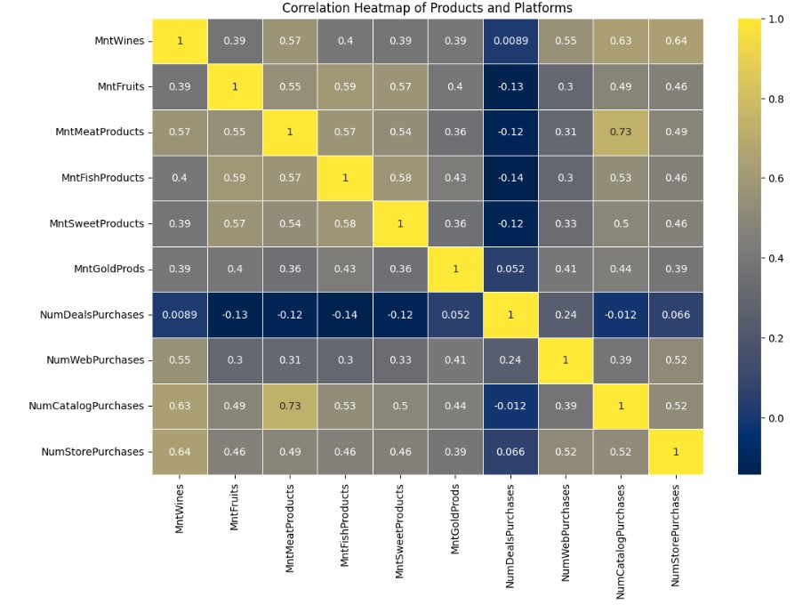
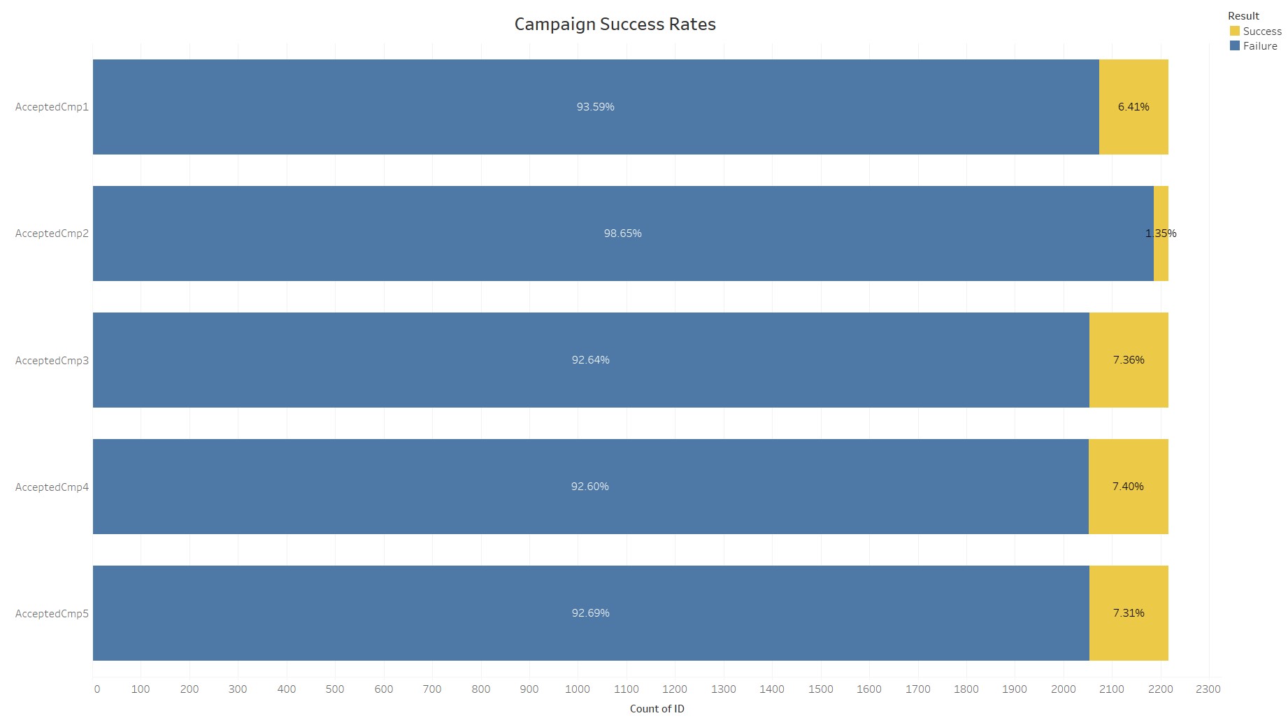
    Product and Purchase Platform Breakdown

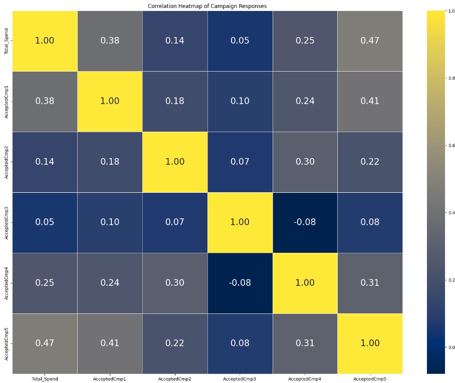
    In order to understand any correlation between each of the products purchased, as well as the platform in which they were purchased, I created a heatmap in Python. There are not necessarily strong correlations but the ones that jump out are: 1) the correlation between meat and wine - as previously noticed, these are popular items, 2) the correlation between fish/sweets and fruit, 
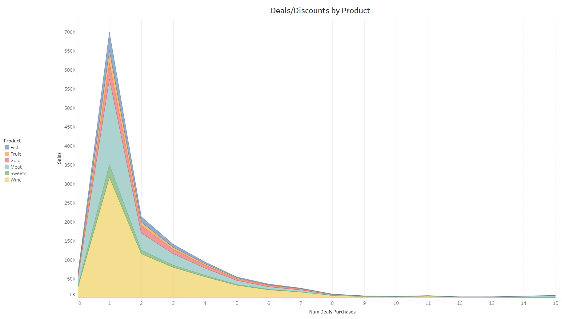
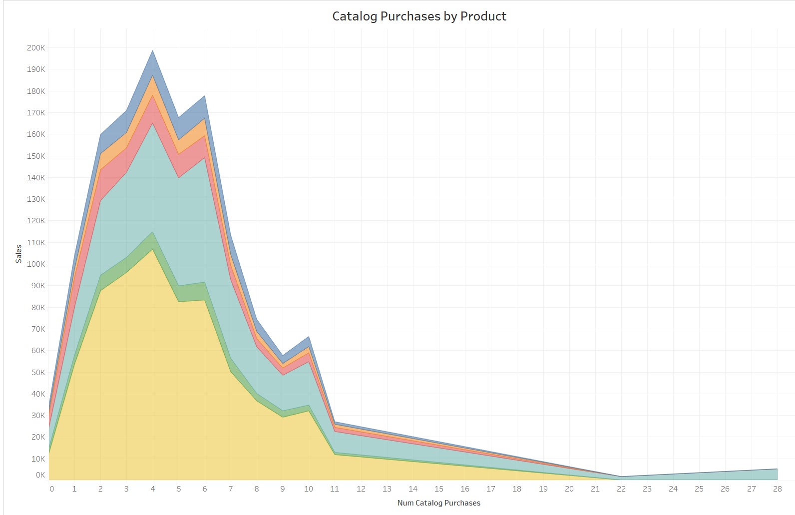
and 3) the meat purchases attributed to purchasing via catalog. There appears to be a very weak correlation between the "deals" (aka discounts) purchases for each of the products. This proves the store could do a better job offering coupons and discounts to drive in more customers.

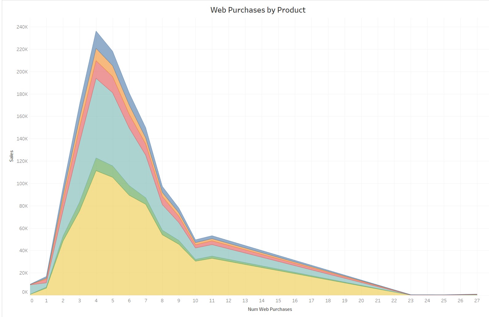
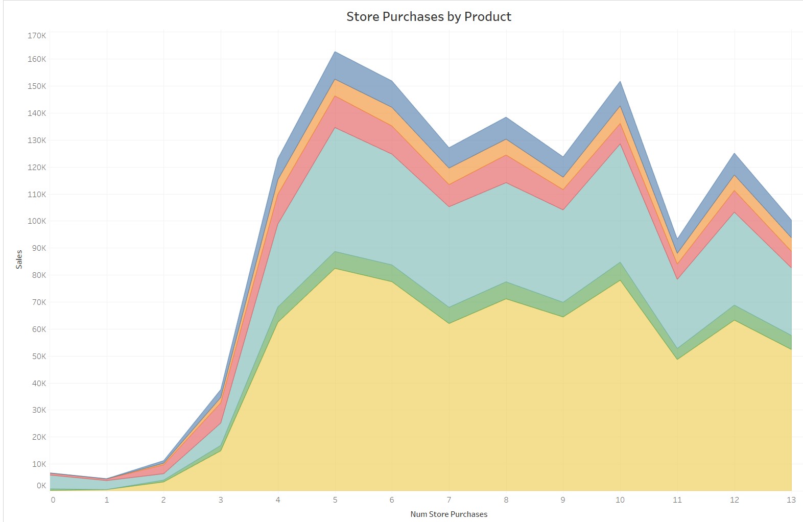
    Below are the four graphs that represent products purchased with a discount, via web, via catalog, and via in-store. Because the first three graphs show a sharp decline over time, the store should work to promote products via these avenues for consistency. Web and catalog could increase due to a revised interface or online-exclusive coupons.

    Click image to enlarge

    Campaign Success Rate

    Campaigns generally saw the same success rate, around 7%. However, the second campaign performed poorly at just 1.4%.

    Click image to enlarge

    Campaign Heatmap

    The following heatmap effectively suggests the likelihood of customers who respond to one campaign would respond to another. It also displays the contribution the campaign made on total spent amount. Campaign 1 and campaign 5 stand out as the most successful in terms of customers reacting to both campaigns and total spending because of the campaigns. The store should analyze each campaign to determine why they were successful and replicate/improve upon them.

    Evaluating Campaign Predictions: Random Forest Analysis

    In this analysis, I've highlighted appropriate steps this company should take in order to make informed, data-driven decisions for customer satisfaction. Lastly, I applied a Random Forest classifier to assess its predictive performance for a campaign. This machine learning algorithm spits out the overall accuracy of its performance to help with future predictions. The test achieved an overall accuracy of 87%, indicating it correctly identified 87% of the samples within our data. Specifically, Class 0 had an 89% precision and Class 1 had a 62% precision; this means Class 1 was not correctly identified amongst true positives. Additional steps should be made to correct any imbalances to improve the model.